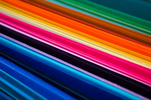
Here is one of the test images she shot, scaled down to 500 px. The subject matter was construction paper used by the scrap-bookers. The camera, a Nikon D2X. The file format - RAW.
On Nov 16, 2006, at 5:49 PM, DMargulis@aol.com wrote in colortheory@yahoogroups.com:
"It is unusual to want to access colors that are both printable and outside of the Adobe RGB gamut. Except for brilliant yellows, these colors do not exist in nature, and cannot be captured by conventional photography."
This is certainly open to debate.
In describing the running argument about what color spaces are appropriate for photographers, my wife reminded me of an image that she shot about a month ago for a scrap-booking club. They wanted a colorful image with "punch" and *very* strong colors that could be used as part of a large sign. Detail was irrelevant. It is the photographer's job to deliver the image the client wants - not to make judgments about whether or not they like the design or idea. My wife delivered.
Here is one of the test images she shot, scaled down to 500 px. The subject matter was construction paper used by the scrap-bookers. The camera, a Nikon D2X. The file format - RAW.
This image prints convincingly better from ProPhoto than it does from sRGB. The print from sRGB looks flat and anemic and lacks the deep, saturated colors of the ProPhoto-derived print. Remember, the client wanted "punch" and strong colors, and it is the photographer/designer's job to deliver. This is a real photograph - not a computer-generated graphic. Here's the tif, in ProPhoto, so you can try this yourself. MD-061103048-b-500.tif (1.3 MB) The ProPhoto image can be converted to sRGB for the following comparisons, to prove that one of the files has not been "doctored."
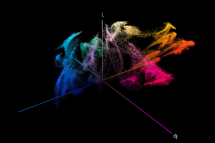
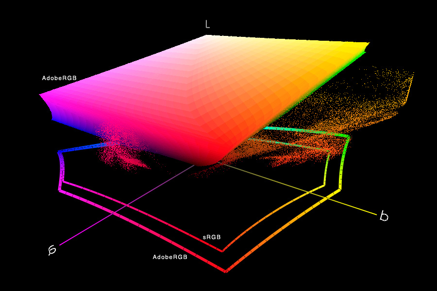
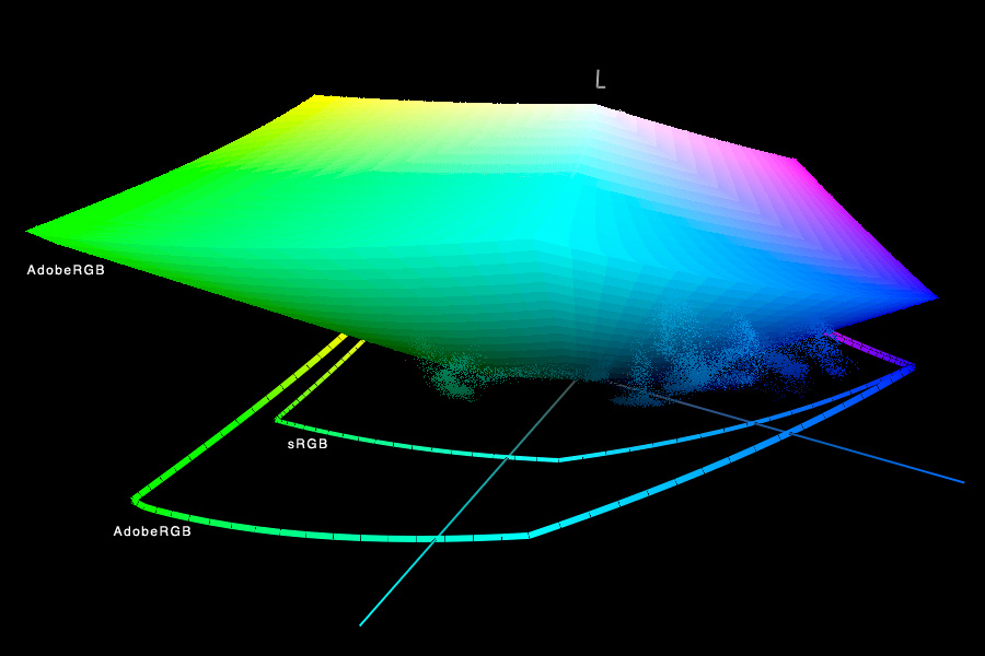
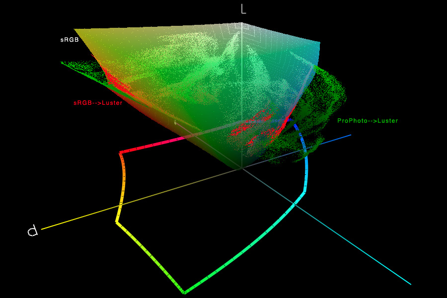
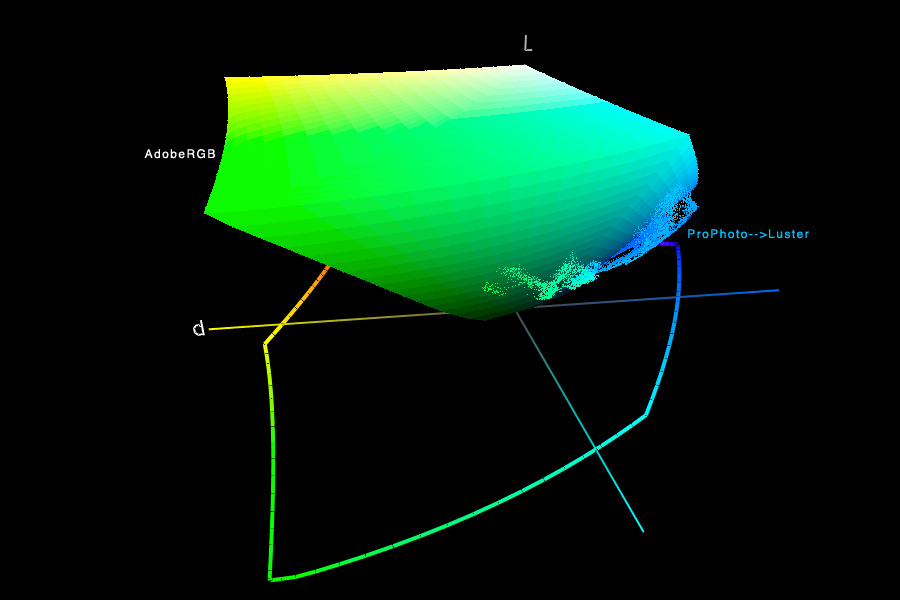
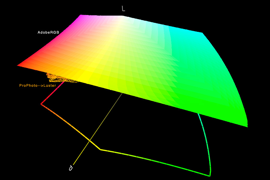
The first graph below, on the top left, shows all of the colors from the TIF plotted in Lab space (click on the graphs to enlarge). The next 3 graphs show that this image is out-of-gamut in both sRGB and AdobeRGB.
 |
 |
 |
 |
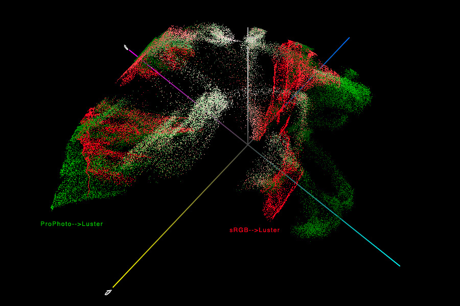
So what happens if you convert the ProPhoto image to the Epson 2200 Luster profile, and compare it with the sRGB image converted to the Epson 2200 Luster profile? It becomes very clear that the sRGB image is not capable of producing all the colors that the Epson 2200 is capable of - it is limited by the boundaries of sRGB. Below are the colors of both images - the "printable colors" - plotted in Lab. The left image shows both sets of image data. The right image shows both sets of image data, plus it superimposes the sRGB gamut. The image that was converted from ProPhoto to Epson Luster was able to "fill up the gamut" of that printer profile, thereby allowing colors to be printed that the sRGB image is incapable of.
 |
 |
You can download and print the TIF on an 8.5 x 11 inch sheet of glossy paper (like Epson Luster) from ProPhoto to a profiled inkjet printer. Then convert the image to sRGB and turn the paper around and print it again. There is no comparison between the two prints. To take full advantage of the gamut of the printer, it is essential to use a wide-gamut color space. That's why it's a recommendation of the UPDIG.
--Rich Wagner
David Cardinal stated:
"While Adobe RGB seemed to be stretched to its limits, it looked pretty good, so while I sure wouldn't process this image in sRGB I don't know whether there is a reason to rule out Adobe RGB."
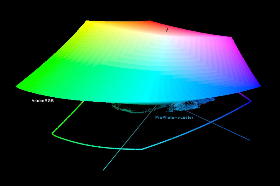
Here's how the data in Epson 2200 Luster printer space compare with AdobeRGB. There are still greens, blue/purples, and some oranges that are OoG, but David is right - it's getting close. It is now a question of whether or not these printable colors are important in the final print. If you are trying to maximize the gamut of the print, I would argue that they are. Of course, the best final test is a side-by-side comparison of two prints.
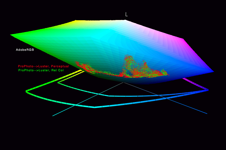
David also raised the important question of rendering intents. All of the previous conversions were made using the perceptual rendering intent, as this is the most common practice (but not necessarily the best on any given image). While the choice of rendering intent is undoubtedly important in many images, changing the rendering intent will still not drive the printer to print the colors that are outside of the working space, whether that is sRGB, AdobeRGB, or something else. A comparison of the image converted from ProPhoto to Luster using both rendering intents is shown on the last image below. (The printable oranges and yellows are still OoG compared with AdobeRGB, not shown.)
 |
 |
 |
 |